Personal branding is popular in the graphic design community. It emphasises the importance of associating images (e.g. logos), colours and fonts with oneself, as this creates consistency, uniqueness, and can tell a story beyond any work presented.
I have explored the idea of a personal brand over the years, initially in relation to my then freelance web design work and more recently to generally augment my work-related online presence. Some of this exploration is documented below.
Logo
Early efforts
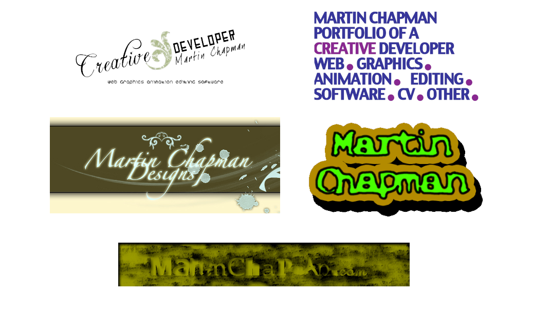
Early efforts at personal branding via a logo (and often associated homepage), referencing either just my name or a constructed brand name, ranged considerably in quality (pictured).
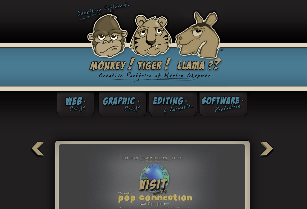
Efforts of note include Monkey! Tiger! Llama?? (pictured), an esoteric brand name designed to emphasise the uniqueness of outputs (the appearance of a llama does not fit the sequence), but was ultimately too conceptually convoluted. It was likely inspired by similar brands at the time.
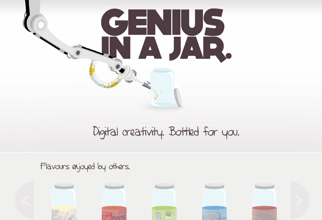
Similarly, Genius In a Jar (pictured), another brand name, gave the impression of self-declared genius, rather than the intended interpretation: the genius (i.e. novelty) of the sites developed.
Regardless, a homage to this site remains in the footer of my design work archive.
Chap-man
A more recent logo-based branding effort sought to play on the fact that the two constituent syllables in ‘Chapman’ are both synonyms for male (‘chap’ and ‘man’). Accordingly, a logo was produced showing two simplified male faces. This logo formed the basis of the first homepage that departs from the sole focus on web design (pictured).
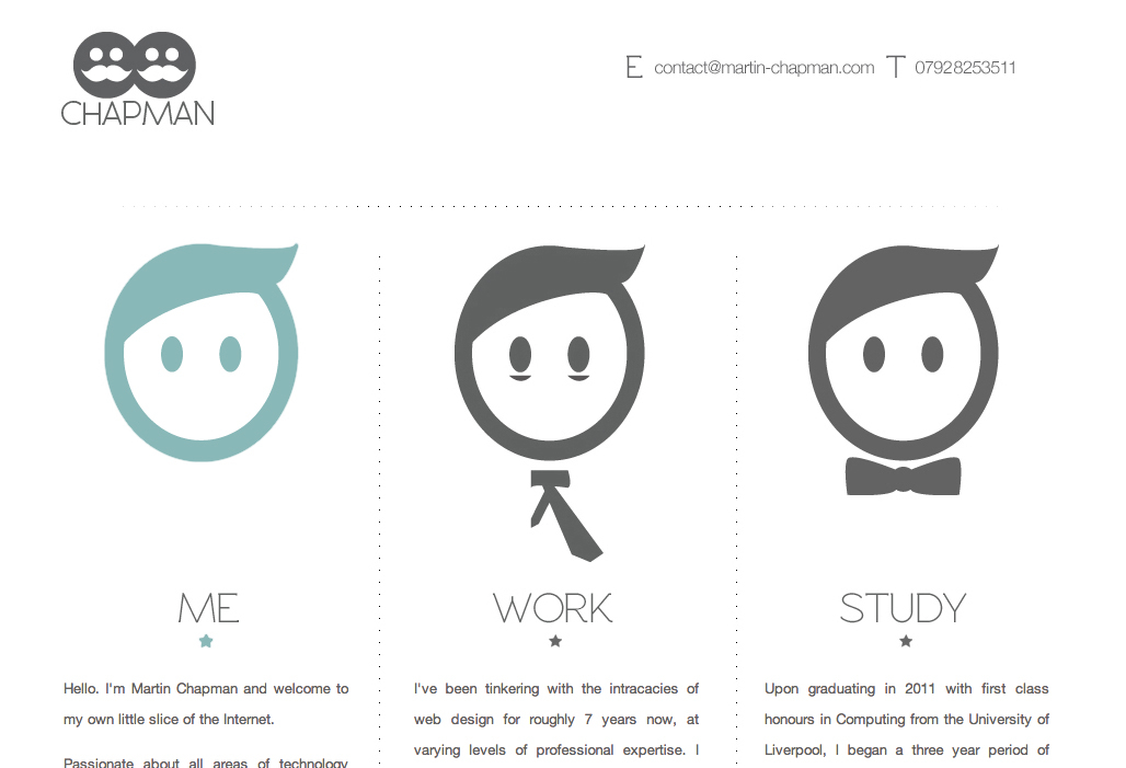
This logo has taken several forms over the years, and remains present as a favicon and in CSS form in the footer of my work-based pages.
Colours
In more recent years, focus has shifted to colours as a form of personal branding.
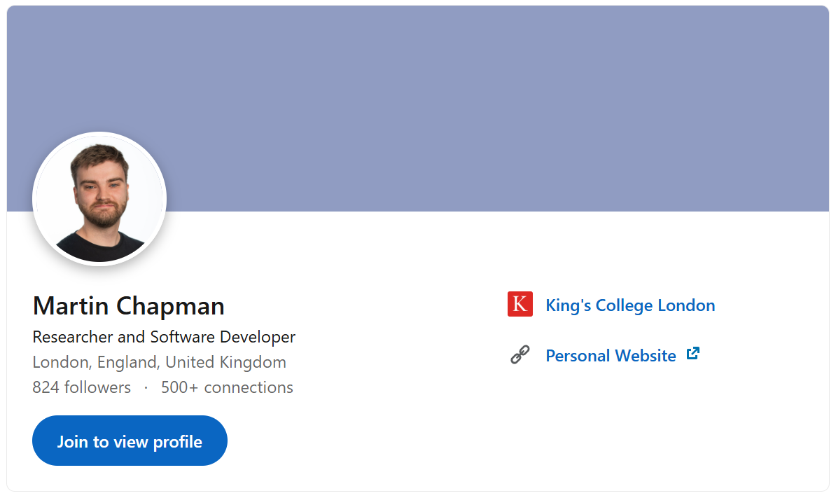
The colour #909CC2 (cool gray) has been selected as a brand colour, and is used across sites including LinkedIn (pictured), and in other locations, such as a foreground colour on my work-based pages.
Similarly, #FF1744 (red (munsell)) is used in my design work archive.
Whole palettes have also been used as branding, such as for kclhi.org (pictured). As in this case, I typically use the excellent site coolors.co to keep track of palettes used in branding efforts, and aesthetically pleasing palettes I observe more generally and want to record for future use (e.g. using the image picker). Some palettes are also an opportunity for a pop culuture nod.
In general, the flexibility to ‘own’ certain colours, due to the wide range available, and the power of these colours to create consistency as part of a brand, is really interesting.
Fonts
The use of fonts as part of a self-brand is less pronounced, but the font Source Serif 4 is used consistently across my work-based pages, for example.
Text in general, however, can be used effectively as part of a brand. I have, for example, consistently used a double hyphen (broadly an em dash substitute) in the salutation component of an email (‘Hi <recipient> --’), rather than the more standard comma.